Gradient maps are a great way to add color to a grayscale image, or to fine tune the existing color of an image. Gradient maps are found under Image > Adjustments > Gradient Map.
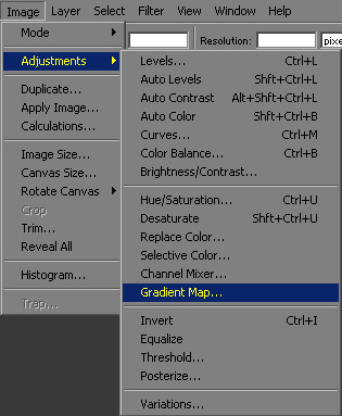
However anytime you use an image adjustment from this menu, it is a one time operation. If you want more control, and most times you will, you should instead add an image adjustment layer. All of the options within the menu above are available as adjustment layers as well. Image adjustment layers are available at the bottom of the layer window.

When added as an adjustment layer, you can bring the settings window back up at any time to adjust the settings you originally chose. Using an adjustment layer also allows you to utilize a mask to control where it's placed, or group it only with the layer below it, or have it affect everything below it, options not available when doing the same operations through the image adjustment menu. This tutorial will be going over the Gradient Map adjustment layer specifically, but the above instructions apply to any of the many options.
Once you choose Gradient Map from the menu that pops up, you will be presented with a window to select the gradient you want to use, and you will see it affecting the layer below.
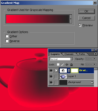
Click on the gradient to bring up the gradient editor window. This is the same window you will be presented with when you try to edit a gradient you want to draw with the gradient tool. You can choose one of their presets, or make your own. I like to create my own because I can save them for future use. One relevant operation is to have settings for various races of skin color, so that you can paint a caucasian skin and then quickly change it to african, asian, or inuit (gotta love those eskimos).

After editing your gradient and hitting ok, you will see the Gradient Map's effect on your layer. I have shown the original layer on the left, and the gradient effect on the right. The Gradient Map re-maps the colors based on value. I overlayed the black and white gradient below the color to help explain it's effects. Anything in the original image that is black in value, gets changed to the color of the gradient at the far left, and anything white in value gets changed to the color at the far right.
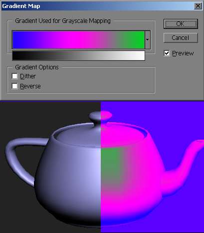
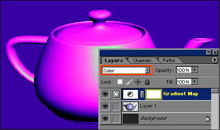
As you can see, the value gets changed as well as the hue. If you desire, you can set the Gradient Map adjustment layer's blending mode to Color, and it will only change the hue, and not the value.
Add a Posterize adjustment layer below the Gradient Map to control the gradient in steps. I also utilized a mask to constrain the effects to just the teapot. For a tutorial on masks, check here. Posterize only has one setting, and that is Levels. Whatever number you enter, is how many steps it clamps the values to.

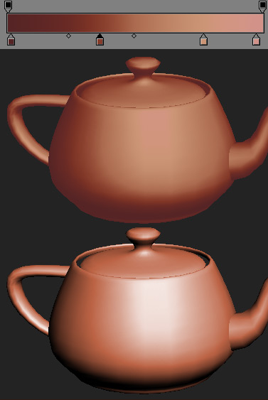
To create truly lifelike skin however, you need to leave the Gradient Map set to normal blending mode, and choose your colors of the gradient with the values built in. This way you can brighten the transitions to simulate different materials. This transition is the magic area, and is the most important part of the coloring. The transition is the main reason that well painted textures done in true color look so vibrant, because the transitions are a different color and value than a simple linear transition between the lights and darks. Even using the Gradient Map you are constrained to one transition color, whereas when painting it by hand, you can vary it based on location and local color. I chose a reddish color that wasn't too dark for the shadows, a much more saturated red with a tinge of orange to it for the transition area, and it is higher in value than a linear transition between my light plane color and shadow color would be. I used a red with much more yellow and very little saturation for the light plane, and then used a very red desaturated color for the highlight color. These choices are all very different from one another and help describe the material type as skin. Compare to the bottom teapot which was colored using the colorize option. Any material with translucency needs control over the transition area to help describe the material type.
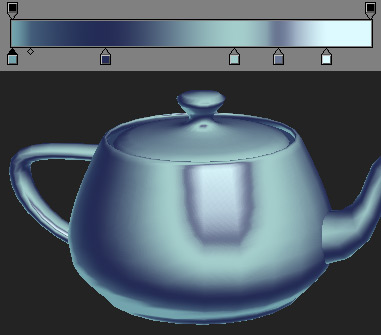
You can accomplish many different material types through saved gradients. The below gradient would be a good start to make something look like chrome. You can see how control over the hue and the value is powerful.
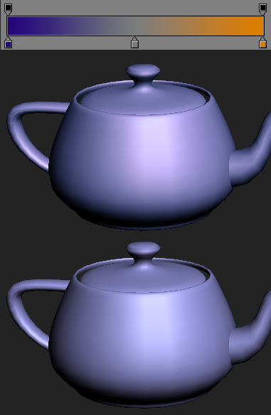
One final usage example is to apply color theory to a model render. I applied a blue/orange gradient to the teapot with a middle gray as the center. The layer is on overlay and backed off to about 40% opacity. This colors the highlights orange, and the shadows bluer, to amp up the contrast. You can pick any color compliments and it will make your model a bit more contrasty with more hue variation.
You can see by now how powerful adjustment layers can be, and specifically Gradient Maps. Just a few closing thoughts:
Use masks to control Gradient Maps.
When you come up with a good gradient, save it as a preset.
Try using the Gradient Map in conjunction with other adjustment layers.
Try using Gradient Map layers on different blending modes.