This tutorial covers my basic principle in creating textures for next gen assets. It picks up where the Normal Map Workflow tutorial left off. I am starting with an existing low poly, with UVs, and a normal map generated from a high poly source. As with everything I write, take it with a grain of salt, compare it to what you know, and figure out what you want to use from it for yourself.
I'm defining next-generation texturing as any asset that uses a per-pixel shader. In older engines, the lighting only shaded an object based on it's vertices. Now we can use individual pixels to alter aspects of the lighting. In the basic implementation, you have at least a diffuse map (just like in earlier games) a normal map, and a specular map. Many engines support more passes than these, but almost all next-gen engines start with at least these three. This tutorial will focus mainly on these three, but will touch on others. I'm starting with a low-poly that already has UVs layed out, and a normal map baked from a high poly source.
My first step is setting up my photoshop file. I open the normal map baked out from max, and ensure it’s the correct size (sometimes baking programs will only spit out square textures, and it’s necessary to resize in one dimension, for example a 1024x2048). I will delete the black in between the normal chunks, and replace it with flat normal color (128,128,255). This prevents any black from showing in mip-maps of the normal.
I will save immediately as a PSD with the filename of my project. I use something descriptive, and with room for alternate versions or body parts. For this asset the PSD is agusturinn_body_01.psd. Asset name first, the body part (as apposed to head or weapon) and the number of the PSD iteration. By the end of the asset I might have four or five versions of the psd.
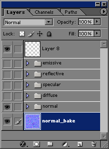
I have created a folder for each texture map I will have for the final asset. By working in one PSD, it makes it easy to move things between maps to ensure consistency of the placement. The foundation of the process for me is the normal map from the high poly. Everything else works off of that. Now that I have the PSD created and the normal bake layer, I have an action that will save out a flattened targa of the current view of the PSD. I use this to save the normal map as the file name (agusturinn_body_01) with _N appeneded (for normal map). I will now assign this to the model in my real time environment (in this case, 3dsmax).
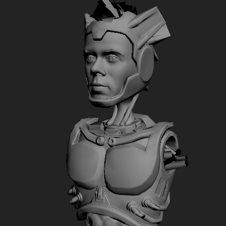
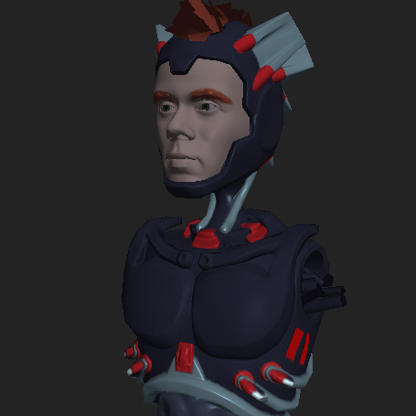
This is how my low poly with just the normal map applied looks. I can examine the normal map to see if I need to clean up any areas, or fix any seams. Right now you can see that everything is perfectly smooth, as if it was made of perfect plastic. Part of this tutorial will cover how I add texture to the surfaces, and ensure it aligns between the different maps to create convincing details.
One problem with this view, is that it looks like a statue, being all grey. I find the first and most important thing for me is to create flat colors for the diffuse map. I do this with both hand-painted, and next-gen assets.
I create solid color layers, which are vector layers that fill the entire canvas with a single color. I like using these, because if I find that one area is off, I can just double click the layer itself, and up pops the color picker, and I can slide around the color picker and watch the layer change in real time.
I use this stage to figure out the color scheme. The final version is going to have these colors come across, even though there is a lot of detail piled on top, so it's best to make sure it works at this point. Already you can see more of the final character, and the colors cheme can guide you in your choosing of details.
Also you'll notice that the colors are quite dark, and this is for a couple of reasons. One is that the specular, when added, will add quite a bit of definition, and secondly, I just wanted some contrast. I was also intending this character to be a bit of a stealth character, so darker colors works well for that.
After finalizing my diffuse map, I try to get a rough start on the specular.
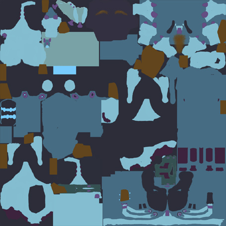
This is actually my specular map. I like using RGB specular, because I feel like it allows me to more properly imply materials on an object. In real life there is no separation between reflection and specularity. An objects shininess and roughness determine how specular highlights behave. And since the real world has a flawless rendering engine, things just look right.
In real time however, our rendering engines are not perfect, so we have to use fakes and hacks. Using a colored specular is one of these hacks. A simple example would be white skin. It's flesh, or peach colored, but the specular works best as a bluey purple.
I pick the specular colors in the same way that I pick the diffuse colors, using solid color layers to choose the brightness and saturation. I try to get the general specular value and color correct, knowing I will go back and add variation and small details later. Getting the broad value figured out now is what I'm after.
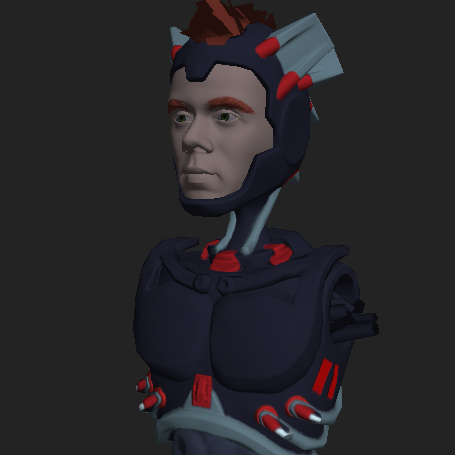
This is the real time asset with the above specular map controling both specular intensity and specular color. You can see on the neck tubes, and ribcage guard, that the bright blue makes it shinier, whereas the dark blue metal parts have a much more dull shine. I wanted the dark blue to be a painted material, so it shines very little.
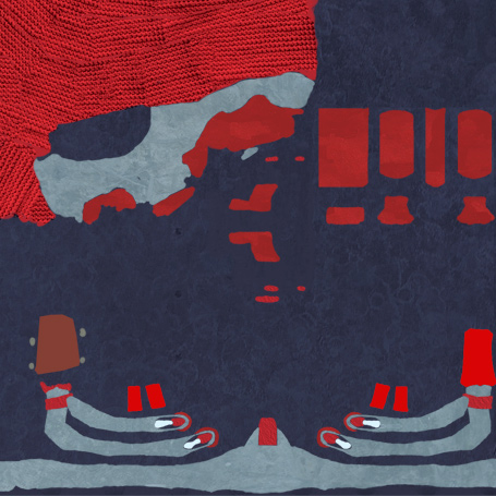
This is a closeup of the diffuse after I've added overlays. I use photos found on the internet or my reference collection, and overlay them on the diffuse. I've brightened the texture so that the details are obvious, because sometimes these textures are quite subtle. They don't need to be as contrasty as with old school textures, because they will also have backup in the normal and specular maps that further define these details.
For the blue, this is a metal overlay, the red also has metal, and the red in the upper left has fabric overlayed. the main purpose of this step is to make sure none of the flat colored layers are completely flat in detail. They need smaller details to break them up and add interest to the middle areas where there isn't busy volume information.
More coming soon - Work in progress.